Extreme weather isn’t new — storms, heatwaves, and floods have always happened. But with climate change, the question is: how much are these events being intensified or made more frequent? That’s what attribution science aims to answer.
The goal of attribution research goes beyond scientific curiosity. It helps us understand how the ‘new normal’ is shifting, and what we need to prepare for. Decision-makers need to know how the probability and severity of extreme events are evolving, so they can take measures to reduce future damage and human suffering. Even in everyday life, these shifts in climate extremes can influence which investments make sense. Scientists must provide this kind of information — and that starts with learning as much as possible about the processes driving these changes.
From “Impossible” to Essential
Since climate scientists specialize in a wide range of subtopics, the IPCC was created by the United Nations to gather, assess, and summarize their findings into reports for decision-makers. IPCC stands for the Intergovernmental Panel on Climate Change. These reports are public and freely accessible—though not always light reading. To make their conclusions more understandable to a broader audience, each report includes a Summary for Policymakers. Since the IPCC covers all aspects of climate change, extreme weather attribution is just one small part of its broader mandate. You can read the latest IPCC Summary for Policymakers (AR6, 2021) here.
Established by WMO and UNEP, the IPCC became the central scientific authority on climate change — including its role in assessing the risks of extreme weather events. Source: UNFCC
The IPCC’s First Assessment Report (1990) captured the thinking of the time, stating it was “virtually impossible to demonstrate a cause-effect relationship with high confidence from studies of a single event.” In other words, at the time, the idea of linking a single extreme weather event to climate change was seen as impossible. This cautious stance reflected the scientific limits of the era — and the belief that individual weather events were too chaotic to connect confidently to climate change.
But science didn’t stand still. Over the next two decades, new methods, improved models, and better data made it possible to explore these connections more rigorously. This shift became clear in later IPCC reports, where extreme event attribution began to appear not just as a possibility, but as a growing field. A major turning point came in 2004, when Peter Stott (Met office, UK) and colleagues published a groundbreaking study attributing the deadly 2003 European heatwave to human-caused climate change — the first of its kind.
From there, the extreme weather attribution community quickly expanded. Existing methods were refined, and new approaches were developed. Not all of these were welcomed with open arms — some sparked heated debate and drew attention from the philosophy of science community. The introduction of the storyline approach, in particular, faced a rigid path to acceptance. It even prompted meta-level discussions about why the method was initially seen as controversial by many in the field. At its core, the debate came down to a difference in scientific approach: storyline methods rely on physical reasoning, while traditional methods rely on probability. Some scientists feared that storylines could increase the risk of false positives (Type I errors), while others argued that sticking only to probability could lead to dangerous false negatives (Type II errors) — missing real signals of climate change.
Today, extreme weather attribution is no longer a speculative idea — it’s a rapidly advancing field with growing public and policy relevance. What was once considered impossible is now done in near real-time: research teams like World Weather Attribution can assess how climate change influenced an event within days. These analyses are increasingly used by decision-makers — from public health officials to city planners — to guide responses and improve preparedness. For example, the 2021 Pacific Northwest heatwave was found to be virtually impossible without climate change — in a study published only days after the event — helping trigger regional conversations about heat resilience, infrastructure, and early warning systems.
These findings increasingly feed into major global assessments, including those of the IPCC — bringing cutting-edge attribution science into the heart of international climate policy. A growing number of attribution studies are now tracked and visualized by organizations like Carbon Brief, offering an overview of extreme weather events around the world that have been formally linked to climate change. See the full interactive map of attribution studies
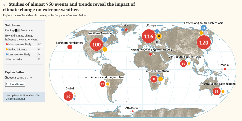
Created by Carbon Brief using peer-reviewed scientific data. View interactive version
How Extreme Weather Attribution Works

Probabilistic (Frequentist) Attribution
When an extreme weather event happens — a heatwave, flood, or storm — stakeholders and policymakers often ask:
Did climate change make this more likely?
One common way to explore this is by comparing the event to the usual range of climate conditions, known as the climatological distribution.
Extreme events tend to fall in the “tail” of that distribution — the rare end of the curve. By seeing where the event sits, we can estimate its return time: how often an event of that magnitude might happen.
This approach is called probabilistic attribution because it estimates the probability of the event happening with climate change and without climate change.
Why large datasets matter
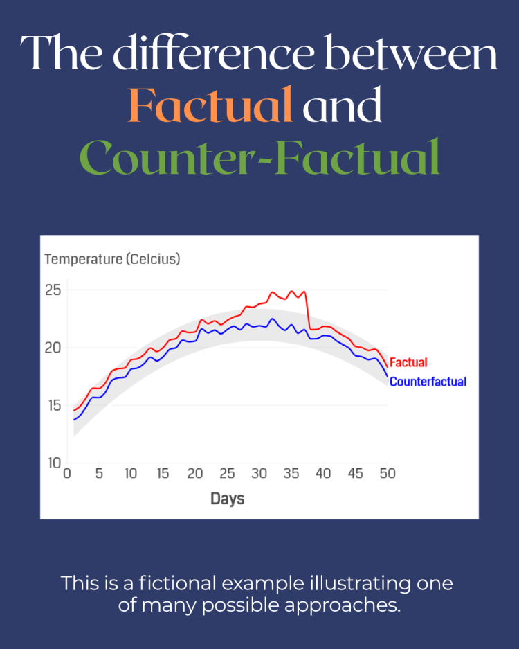
To make these estimates statistically meaningful, we can’t rely on a single occurrence. Instead, we run large numbers of climate model simulations — often hundreds or thousands — to build two different worlds:
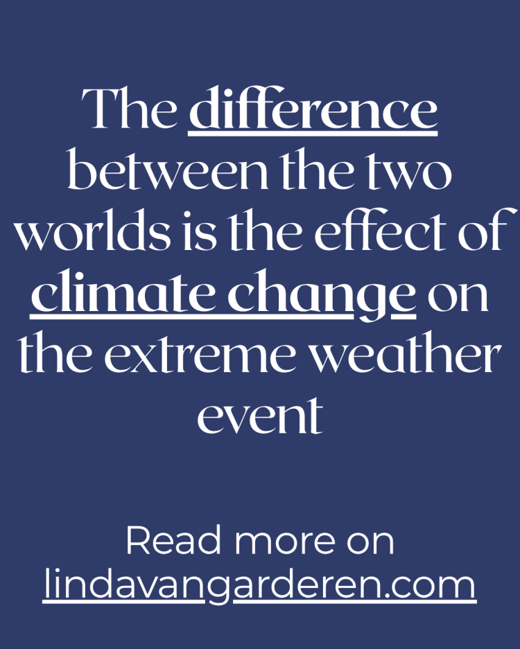
- Factual world: The climate as it is today, with current greenhouse gas levels and present-day sea surface temperatures.
- Counterfactual world: A climate without human-caused changes, adjusted to pre‑industrial greenhouse gas concentrations and sea surface temperatures.
If you’re curious to explore reputable climate model datasets — presented in an accessible, non‑technical way — the Coupled Model Intercomparison Project (CMIP) offers exactly that. CMIP is a global, coordinated effort where different climate models run standardized experiments. It provides open-access data that researchers worldwide use to compare simulations under historical, present-day, and future scenarios — all explained clearly and with user-friendly documentation.
From one event to an “event class”
With this method, we don’t analyse just the one observed event. Instead, we define an event class — a set of events with similar characteristics.
For example: “all instances of three or more consecutive days above 25°C in this region.” Each of those events acts as a stand-in for the event we’re studying.
Model simulations then estimate how likely this class of events is in both the factual and counterfactual worlds.
An example: the 2010 Russian heatwave
In a study by Otto (2017),researchers compared monthly average temperatures for heatwaves in a region of Russia in the two worlds. In the pre-industrial climate, a heatwave of that intensity might have happened only once in 100 years. In the present-day climate, the same heatwave could occur roughly once in 40 years.
The graph below shows this difference: the red curve (today’s climate) shifts toward higher temperatures compared to the blue curve (earlier climate), meaning events like 2010’s heatwave have become both hotter and more frequent.

Original Paper: Otto 2017
This means climate change has made such an event more than twice as likely. The accompanying graph shows that return time and probability are simply two ways of expressing the same information — one on each axis.
Storyline attribution
Work in progress
